
What you can do
Build your own CRIBWISE report – a table or one of seven chart types – by dragging fields from a reporting data source into the report designer. The report is saved next to the built-in reports, and you open, filter, export and schedule it like any other report.

Before you start
- Your user group needs the Create privilege for Report. Changing a report later needs Update, and removing it needs Delete. The privileges are set per user group under Administration > Group management > AP Privileges > Entity Privileges – see Admin Portal permissions reference.
- Decide which data source the report reads. The data source decides which fields you can use, and which of them can be grouped or summed. See Report data sources reference.
- Decide the report type: a table, or a pie, column, bar, line or combined chart. See What each report type looks like.
Important: The data source and the report type are locked at the first Save. To change either one later, create a new report.
Tip: A built-in report can be a quicker start. Open it and select Copy report – see Copy the report before you change it.
Quick start
Experienced users – create a report in 4 steps:
- Go to Reports > Report viewer and select New report.
- Enter a Name, choose the DataSource and the Report type, then select Save.
- Drag fields from Available fields into the zones on the right.
- Select Save, then Test run.
Need more detail? Follow the full steps below.
Steps
The steps build an example table report, Transactions per device, on Raw transactions data. A chart report is built the same way, with different zones.
Step 1 — Start a new report
- In the main menu, select Reports > Report viewer.
- Select New report above the list of reports.
The Report panel opens on the Report definition tab. The Filters and Scheduler tabs and Test run stay greyed out until the report has been saved once.
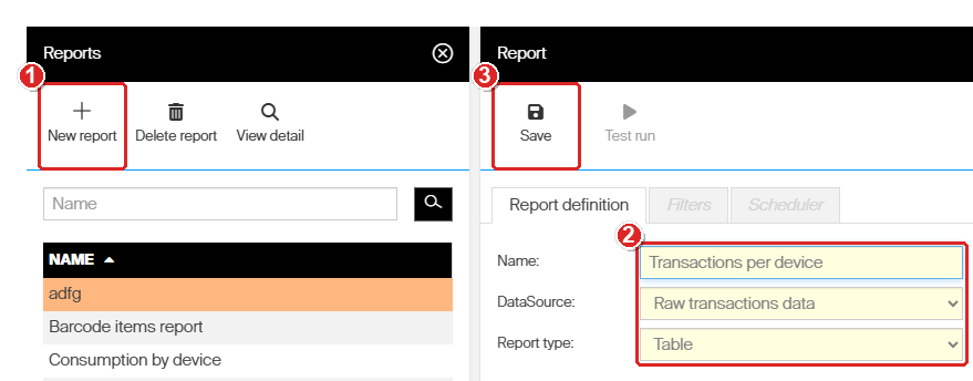
(1) New report, (2) the three fields to fill before the first save, (3) Save.
Step 2 — Name the report and choose its data
- In Name, type a name for the report. It must be different from every other report, built-in reports included.
- In DataSource, choose the data the report reads: Assignment (inventory, restock) data, Raw transactions data, Orders data, Stock history data or Stock locations data.
- In Report type, choose the report type.
- Select Save.
The message The Report [name] has been successfully saved appears. The designer now shows the fields of the data source under Available fields, and a set of drop zones for the report type. DataSource and Report type are greyed out from now on.
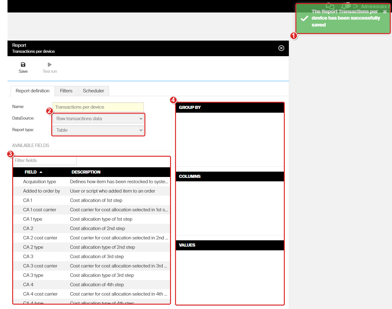
(1) The report is saved, (2) data source and report type are now locked, (3) the fields of the data source, (4) the drop zones – here the three zones of a table.
| Report type | Zones in the designer | Use it to |
| Table | Group by, Columns, Values | List rows, optionally grouped, with totals. |
| Pie chart | Categories, Value | Show each category’s share of a total. |
| Column chart | Categories, Value, Series | Compare categories side by side. |
| Stack column chart | Categories, Value, Series | Compare category totals, each split into its parts. |
| Bar chart | Categories, Value, Series | The column chart turned on its side – easier to read with long category names. |
| Stack bar chart | Categories, Value, Series | The stacked column chart turned on its side. |
| Line chart | Categories, Value, Series | Follow a value over time, one line per series. |
| Combined chart | Categories, Value, Value 2 | Compare two values for the same categories, as columns and a line. |
Step 3 — Drag fields into the zones
- In Filter fields, type part of a field name to shorten the list – for example device.
- Drag the field from the list onto a zone.
- Repeat for every field the report needs.
A field you drop is added at the top of the zone and disappears from Available fields. The report shows the fields in the order they have in the zone. To take a field out again, drag it back onto the field list.
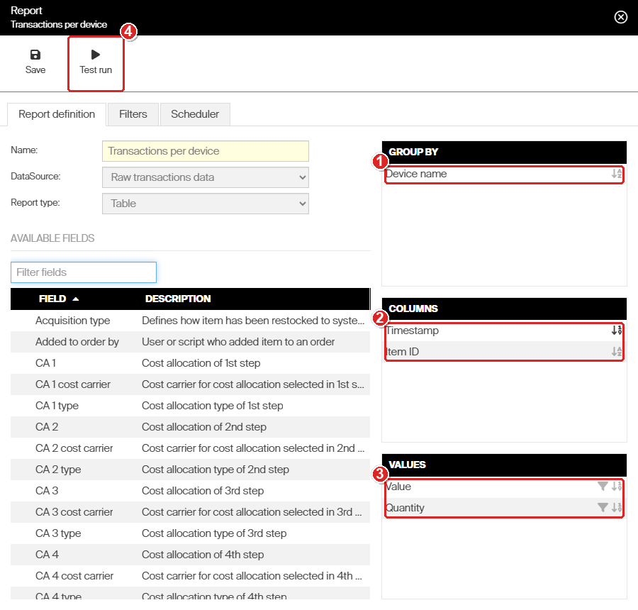
The example report: (1) rows grouped by Device name, (2) Timestamp and Item ID as plain columns, (3) Value and Quantity summed per device, (4) Test run is available as soon as a zone holds a field.
| Zone | Report types | What it does |
| Group by | Table | Groups the rows by this field. Each group can be collapsed and expanded in the report, and shows the totals of the Values fields. |
| Columns | Table | Plain columns, one value per row – even when rows repeat the same value. |
| Values | Table | Number fields that are summed per group. A grand total is shown at the bottom of the report. |
| Categories | All charts | The field the chart is drawn per: the slices of a pie, the columns or bars, the points of a line. Takes one field. Required. |
| Value | All charts | The number that is summed per category. Takes one field. Required. |
| Series | Column, bar and line charts, stacked or not | Splits each category by a second field – one colour, or one line, per value. Optional. |
| Value 2 | Combined chart | A second number, drawn as a line on its own axis. Required. |
Note: Only fields that can be summed – such as Quantity, Consumed quantity, Value or Usage cost – can go into Values, Value and Value 2. Text fields, dates and IDs are refused. The Values column in Report data sources reference lists which fields qualify.
Step 4 — Sort and slice the data (optional)
Every field in a zone has a Sort by icon. Fields in Values or Value also have a Slice by icon (a funnel).
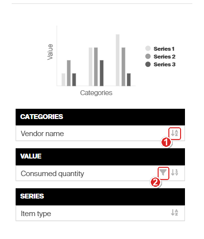
The zones of a column chart, with the preview sketch above them: (1) Sort by, (2) Slice by.
- Sort by – select it once to sort ascending, again for descending, and a third time to stop sorting on that field. Only one field sorts the report at a time: sorting another field turns the first one off. The icon of the active sort is darker.
- Slice by – shows only the highest or lowest records by that value. It opens Data slice settings: choose Top or Bottom in Show only, type the number of records in Values, then select Set. To remove the slice again, open it and select Clear filter.
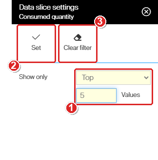
Data slice settings: (1) show only the top 5 records, (2) Set applies the slice, (3) Clear filter removes it.
Step 5 — Set the filters (optional)
Open the Filters tab to limit what the report reads – a time period, transaction types, devices and so on. These filters apply every time the report is opened or sent. See How to use report filters.
Important: With Raw transactions data, filter on transaction type to get meaningful totals. Total consumption, for example, needs the Pick, Return and Scrap transactions only.
Step 6 — Save and test the report
- Select Save.
- Select Test run.
Test run also saves the definition, then opens the report next to the designer. There you can check the result and go back to the designer to adjust it.
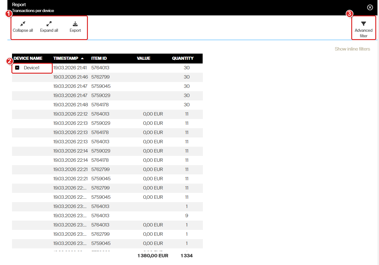
The example report in a test run: (1) the toolbar of a test run, (2) rows grouped per device with the values summed, grand totals at the bottom, (3) Advanced filter.
A test run has a limited toolbar: Collapse all, Expand all, Export and Advanced filter for a table, and Export and Advanced filter for a chart. Edit report, Copy report and Pin to dashboard appear only when you open the report from the list.
Success: The report is in the list of reports. Select it and select View detail to open it with the full toolbar.
What each report type looks like
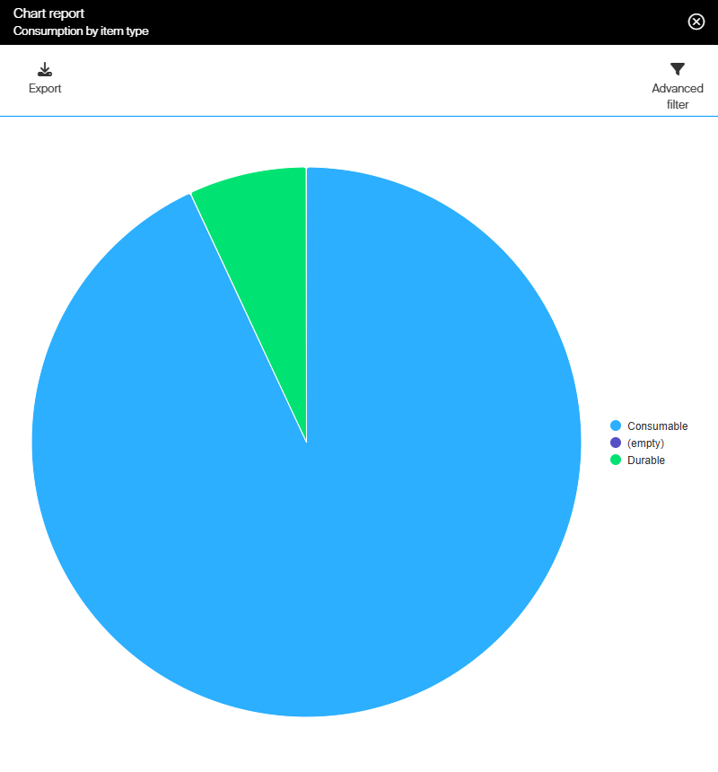
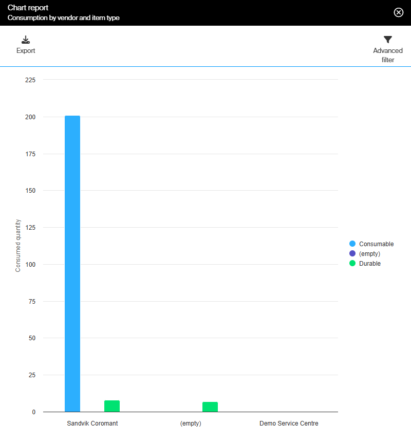
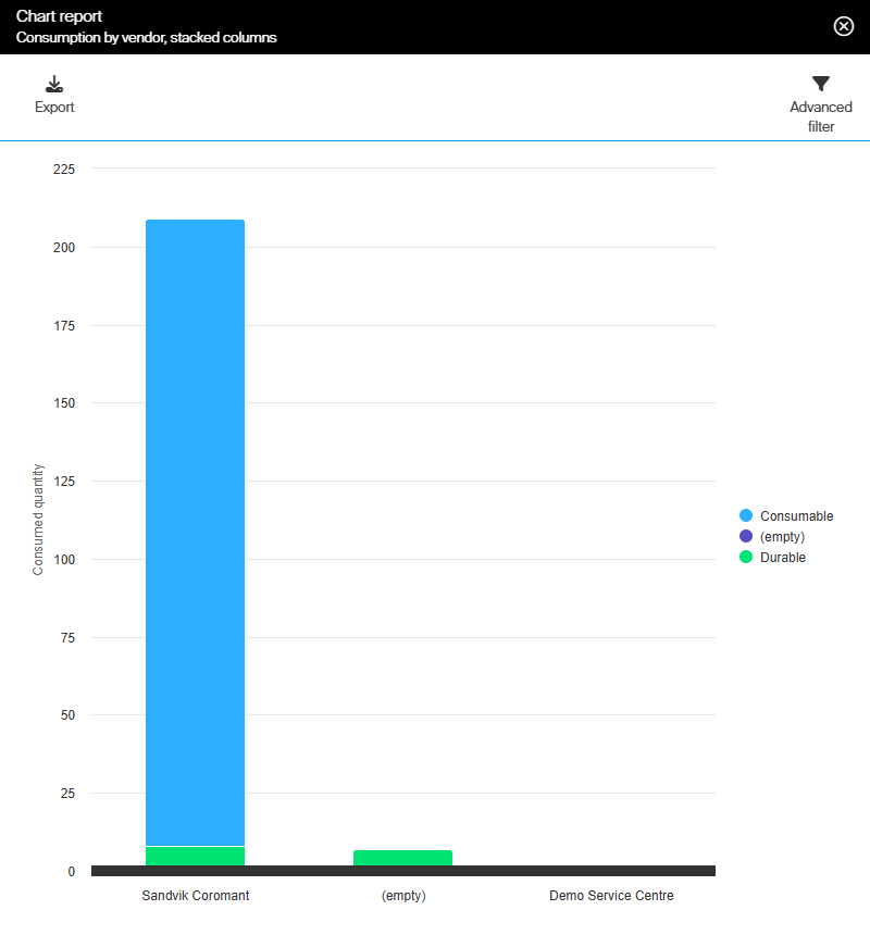
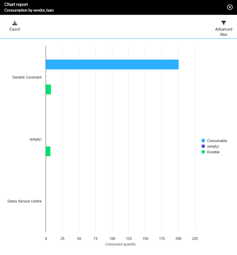
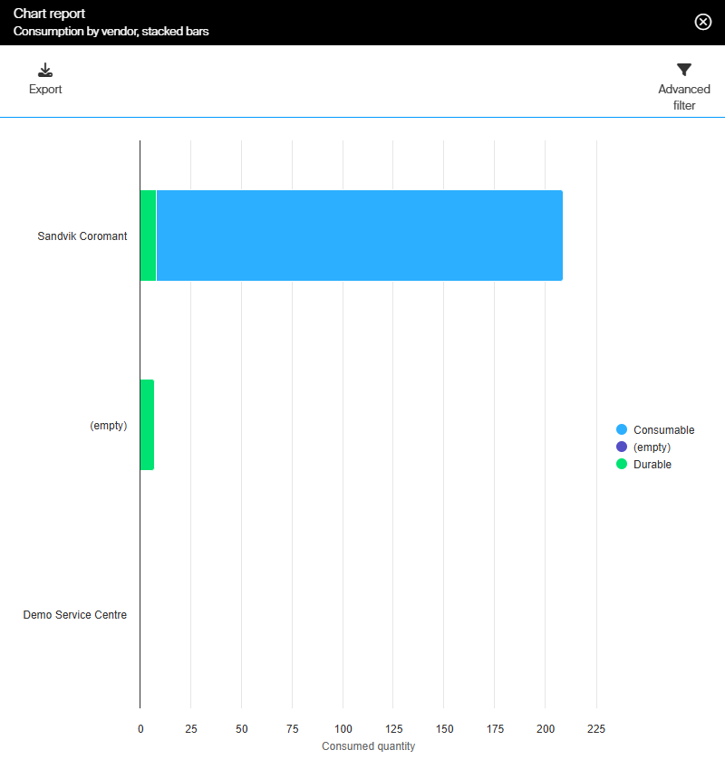
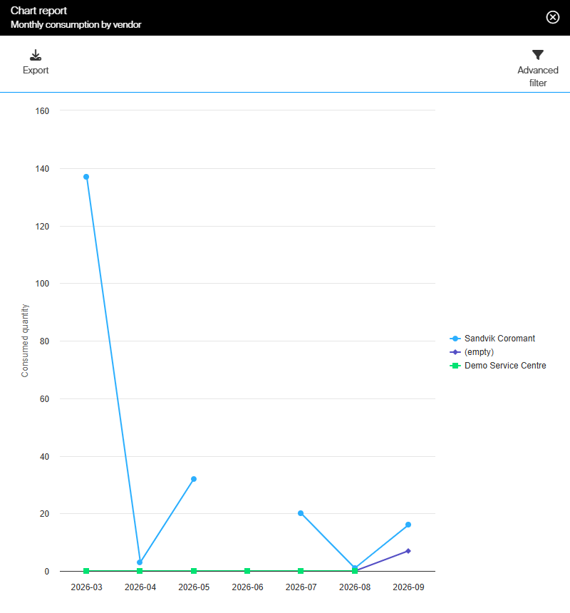
Every chart below was built on Raw transactions data, with Consumed quantity as the value.
Pie chart
Categories Item type, Value Consumed quantity. Each slice is one category.
Column chart
Categories Vendor name, Series Item type, Value Consumed quantity. The series stand side by side within each category.
Stack column chart
The same fields as the column chart. The series are stacked, so the height of a column is the category total.
Bar chart
The same fields again, with the categories on the vertical axis.
Stack bar chart
The stacked version of the bar chart.
Line chart
Categories Year-Month, Series Vendor name, Value Consumed quantity. One line per vendor, month by month. A time field such as Year-Month, Week or Year suits the categories of a line chart.
Combined chart
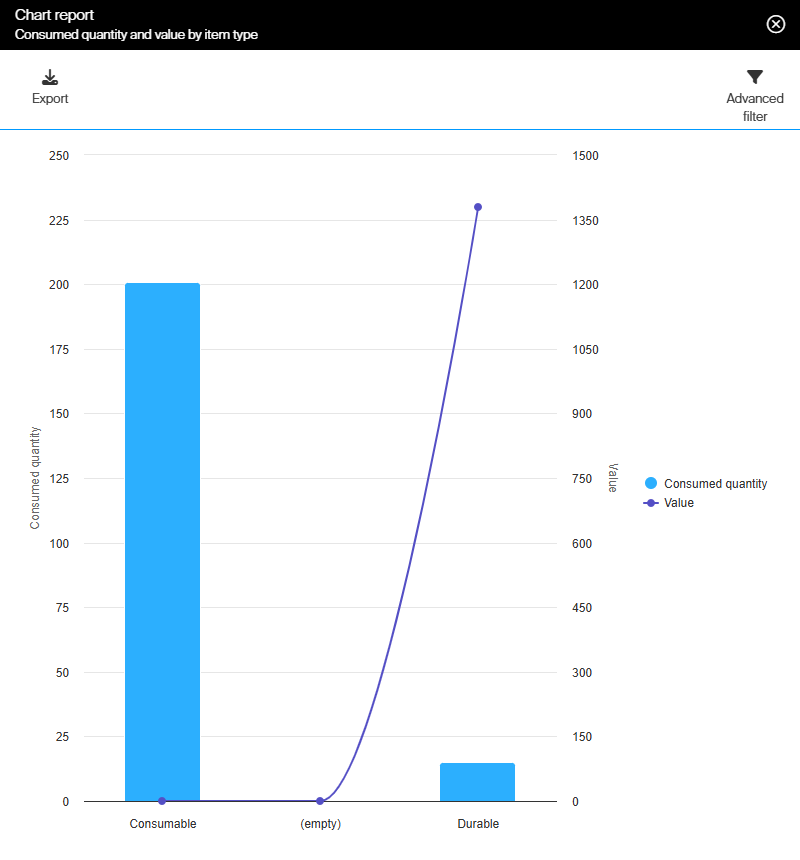
Categories Item type, Value Consumed quantity, Value 2 Value. Value is drawn as columns on the left axis, Value 2 as a line on the right axis.
Change or delete a custom report
- Change it – select the report in the list, select View detail, then Edit report. You can change the name, the fields, the filters and the schedule, but not the data source or the report type.
- Delete it – select the report in the list and select Delete report. Answer Yes to Do you really want to delete the report [name]?
Warning: Closing the designer with unsaved changes asks There are unsaved changes, do you really want to leave this page and lose all the changes you made? Select No and save first – Yes discards the changes.
Next steps
- Schedule it – send the report by email or to an FTP server on a fixed schedule. See Schedule automatic sending.
- Pin it to the dashboard – show the report as a widget on the home page. See How to configure dashboard widgets.
Troubleshooting
| Problem | Likely cause | Fix |
| Report name is not unique when you select Save. | Another report, built-in or custom, already has that name. | Choose a different name. |
| Save does nothing and a zone is outlined in red. | A required chart zone is empty: Categories, Value, or Value 2 on a combined chart. | Drag a field into the outlined zone, then save. |
| There are no fields and no zones to drag them to. | The new report has not been saved yet. | Fill in Name, DataSource and Report type, then select Save. |
| Test run is greyed out. | No zone holds a field yet. | Drag at least one field into a zone. |
| A field will not drop into Values, Value or Value 2. | Only fields that can be summed are accepted there. | Use a number field. Check the Values column in Report data sources reference. |
| A field is missing from Available fields. | It is already in a zone, or Filter fields still holds text. | Look in the zones, or clear Filter fields. |
| DataSource and Report type are greyed out. | Both are locked at the first save. | Create a new report with the data source and type you need. |
| Edit report and Copy report are missing. | The report is open in a test run, which has a limited toolbar. | Close it, then open the report from the list with View detail. |
Related articles
- Report data sources reference – every field you can put in a report, and which can be grouped or summed.
- How to use report filters – limit the data a report reads.
- How to run, filter, and schedule a pre-defined report – open, export, copy and schedule any report.
- Understanding tabular and chart reports – the report list and the report viewer.
- Default reports reference – the built-in reports you can copy instead.
- How to configure dashboard widgets – show a finished report on the dashboard.
- Admin Portal permissions reference – the privileges behind creating and changing reports.