
What you can do
Build your own report on any CRIBWISE reporting data source, as a table or as one of six chart types, and save it alongside the predefined reports.
See Report data sources reference for what each data source contains.
Before you start
- You need the privilege to create reports. Without it, New report is disabled.
- Decide on the data source and the report type first – neither can be changed after the report is saved.
- The report name must be unique among the existing reports.
Tip: To adapt a predefined report, open it and select to copy it. The copy can be saved as a custom report whose content you can change.
Quick start
Experienced users – create a report in 4 steps:
- Select New report in Reports → Report viewer.
- Name it and choose the data source and report type, then save.
- Drag the available fields into the report sections.
- Save, or use test run to see it in the viewer.
Steps
Step 1 — Create the report
Select New report in the list of reports, reached with Reports → Report viewer in the main menu.
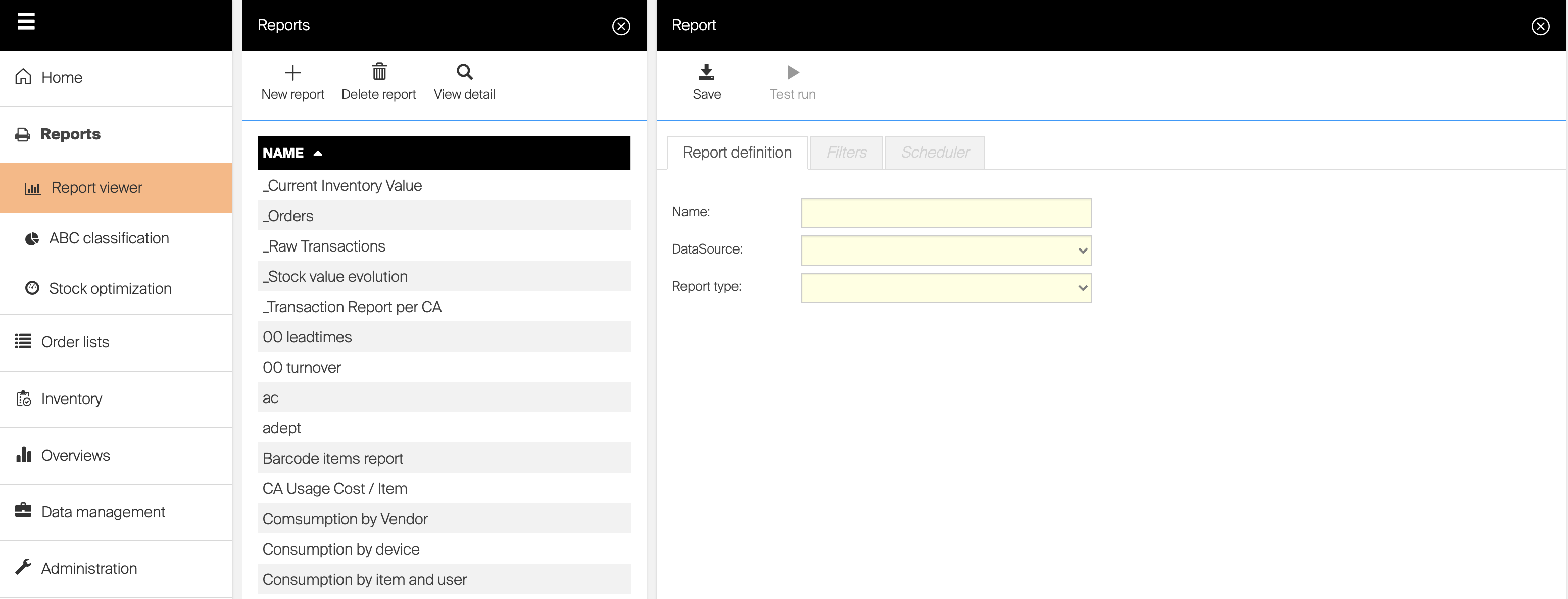
Starting a custom report.
Step 2 — Fill in the report definition
Give the report a name, choose the data source and the report type, and save once before continuing – the definition needs a saved data source. The fields of each section are described below.
Step 3 — Save or test the report
Two actions are available in the report designer:
 |
Saves the current definition. Not available for default reports, or without the privilege to update reports. |
 |
Saves the changes and shows the report in the report viewer. The viewer is limited here – Copy report and Edit report are not available. |
Success: The report appears in the report list with type Chart (Custom) or Tabular (Custom).
Report definition
| Option name | Functionality |
| Name | Defines name of a report. Name of report must be unique in set of existing reports |
| Data source | Defines data used for the report. Data source must be selected and report initially saved before report definition can continue. Data source cannot be changed for already saved reports. |
| Report type | Defines, how data will be visualized. Definition of each type can consist from different settings. Each type is described further in this chapter. Report type cannot be changed for already saved reports. |
| Available fields | Shows all available information, which can be used in the report based on selected data source. If column is a value type (can be aggregated), it is marked in the list by  icon. Columns can be moved to different report’s sections using drag and drop icon. Columns can be moved to different report’s sections using drag and drop |
Sorting  |
Data in report can be sorted according selected data field used in report definition. To activate sorting, click to sorting icon for selected data field (  ). Change sorting order by following click. Remove the sorting by clicking the icon for the third time or by activating sorting for another data field. ). Change sorting order by following click. Remove the sorting by clicking the icon for the third time or by activating sorting for another data field. |
Slicing  |
Only top/bottom records by value can be shown in report by activating slicing. Slicing can be set by one data field used in Values section of report definition. To activate slicing, select slicing icon shown for value data field (  ), and define slicing options (number of shown Top/Bottom records). To deactivate slicing, select the icon again and select Clear filter. ), and define slicing options (number of shown Top/Bottom records). To deactivate slicing, select the icon again and select Clear filter. |
Tabular report
Tabular report shows data in form of a table. Information in the table can be grouped by specific values or can be displayed in flat structure.
| Group by | Contains fields which will be used to group data by. In report viewer, these fields will be able to collapse and expand to show all related information. Fields from the group can be moved to different section or back to available fields section using drag and drop |
| Columns | Contains fields which will be used in the report to present data in flat form. Fields from the group can be moved to different section or back to available columns section using drag and drop |
| Values | Contains fields of value type which will be used in the report to show aggregated values (sum of values) per each field selected in Group by section. Grand totals per all data are always shown at the bottom of the report. Only fields marked as values ( ) can be placed to this section.Fields from the group can be moved to different section or back to available fields section using drag and drop |
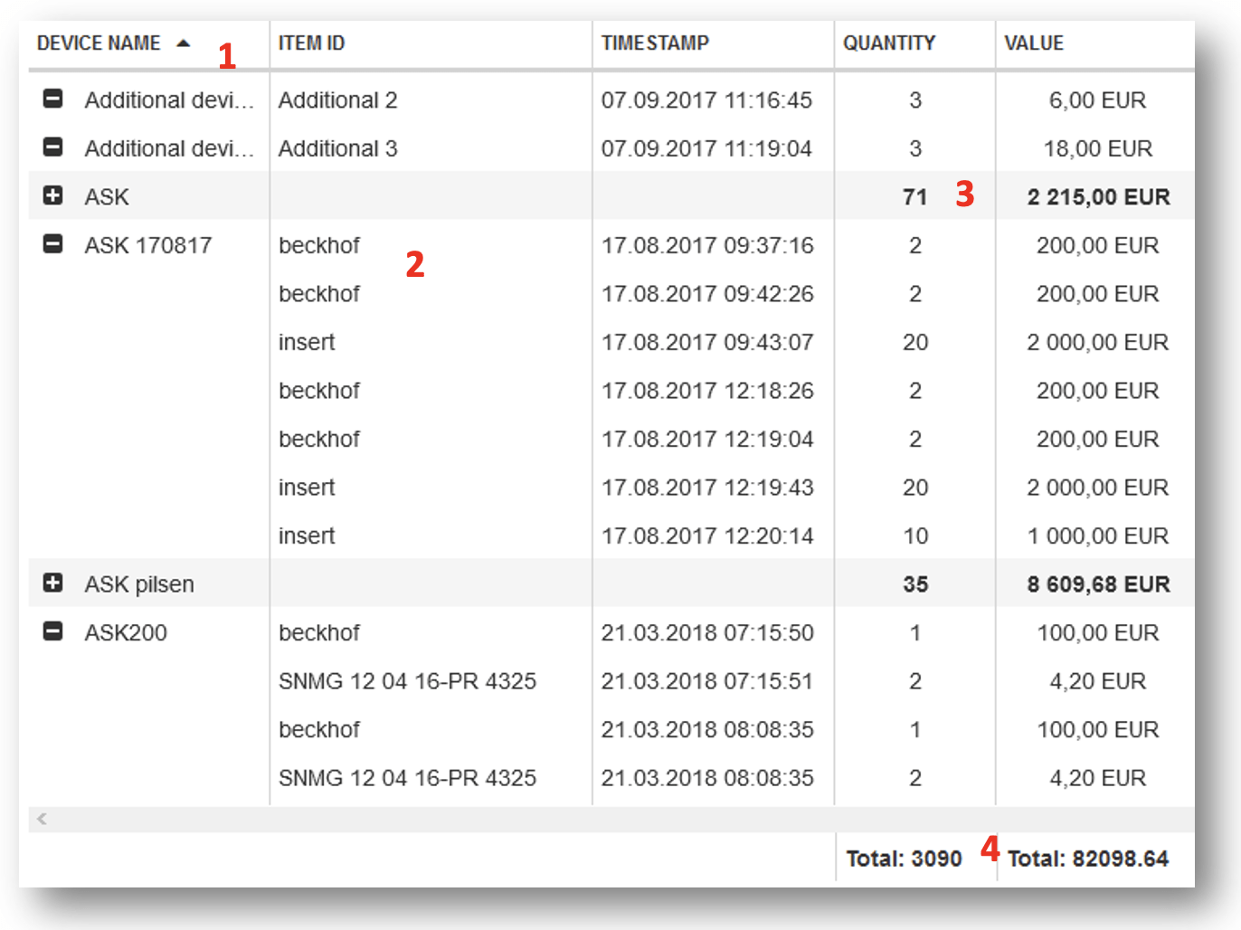
Example In following example, report definition is defined as follows: Group by device name, allowing to show all operations per each device. Reporting data can be expanded and collapsed per device
(1). Columns set to show Item ID and Timestamp. For each transaction, information in these columns are shown, even if contains the same value
(2). Values set to show Quantity and Value. These values are aggregated for each collapsed group
(3) and per complete report
(4).
Values will not be aggregated in case, when collapsed group contains values in different currencies.
Pie chart
Pie chart report shows specific value according single axis
| Categories | Contains field which will be used as axis for the chart. All data fields allowing grouping a data can be used. One data field must be specified to allow report to be saved and executed. Fields from the group can be moved to different section or back to available fields section using drag and drop |
| Values | Contains field of value type which will be used in the report to show aggregated values (sum of values) per each category selected in Categories section. Only fields marked as values ( ) can be placed to this section.One data field must be specified to allow report to be saved and executed. Fields from the group can be moved to different section or back to available fields section using drag and drop |
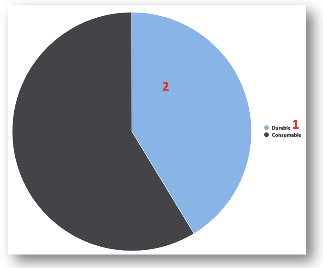
Example In following example, report definition is defined as follows:
Categories set to item type
(1). Value set to consumed quantity
(2).
Column chart
Column chart allows to show reporting data using two axis by side-by-side comparison.
| Categories | Contains field which will be used as X for the chart. All data fields allowing grouping a data can be used. One data field must be specified to allow report to be saved and executed. Fields from the group can be moved to different section or back to available fields section using drag and drop |
| Series | Contains field which will further separate categories per another dimension. Option is mandatory. If series is not specified, single default series will be used in report. Fields from the group can be moved to different section or back to available fields section using drag and drop |
| Values | Contains field of value type which will be used in the report to show aggregated values (sum of values) per each category selected in Categories section and Series (if set). Only fields marked as values ( ) can be placed to this section.One data field must be specified to allow report to be saved and executed. Fields from the group can be moved to different section or back to available fields section using drag and drop |
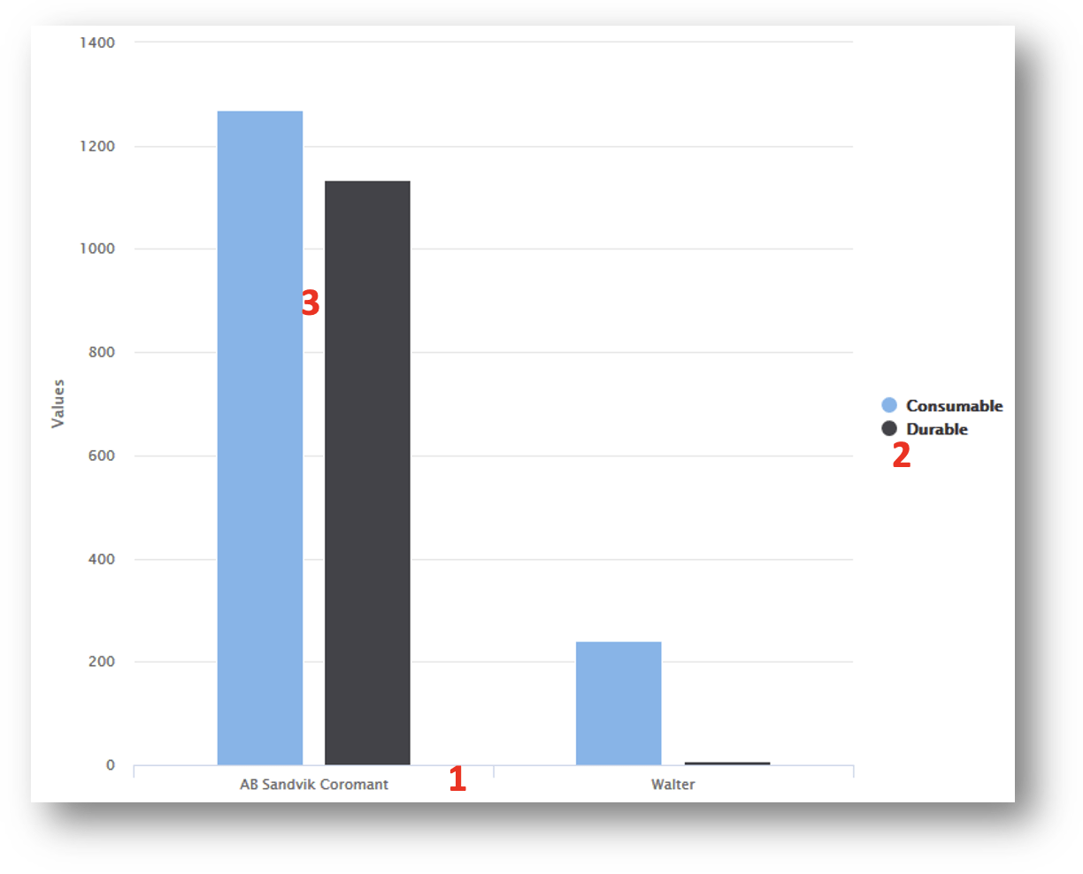
Example In following example, report definition is defined as follows:
Categories set to vendor name
(1). Series set to item type
(2). Value set to consumed quantity
(3).
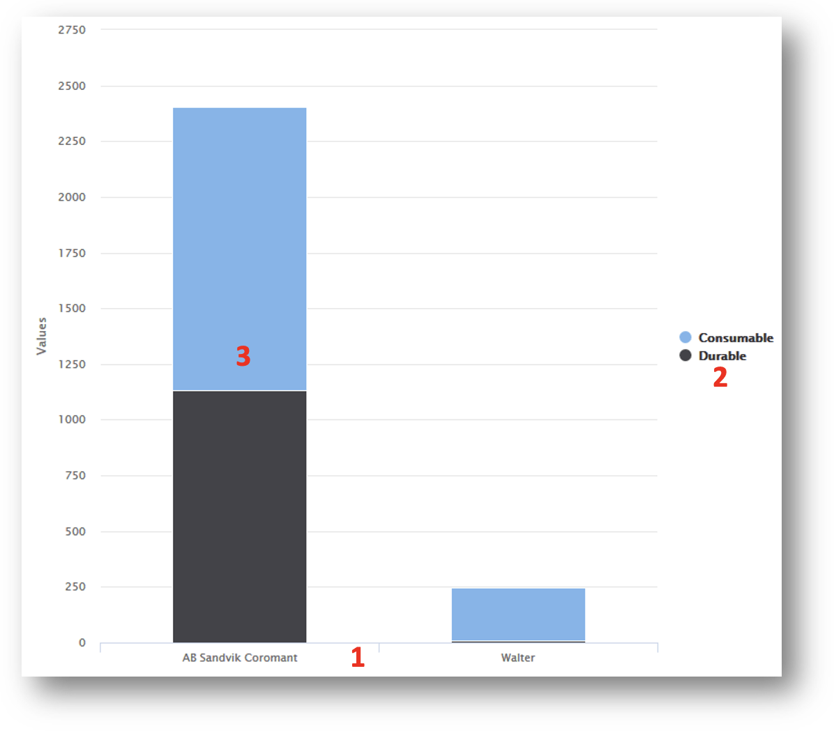
Column chart stacked
Column chart allows to show reporting data using two axis by total value comparison.
| Categories | Contains field which will be used as X for the chart. All data fields allowing grouping a data can be used. One data field must be specified to allow report to be saved and executed. Fields from the group can be moved to different section or back to available fields section using drag and drop |
| Series | Contains field which will further separate categories per another dimension. Option is mandatory. If series is not specified, single default series will be used in report. Fields from the group can be moved to different section or back to available fields section using drag and drop |
| Values | Contains field of value type which will be used in the report to show aggregated values (sum of values) per each category selected in Categories section and Series (if set). Only fields marked as values ( ) can be placed to this section.One data field must be specified to allow report to be saved and executed. Fields from the group can be moved to different section or back to available fields section using drag and drop |
Example In following example, report definition is defined as follows:
Categories set to vendor name
(1). Series set to item type
(2). Value set to consumed quantity
(3).
Bar chart
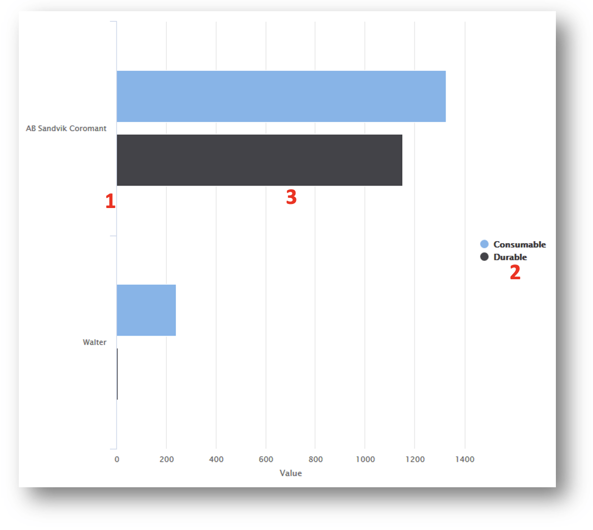
Bar chart allows to show reporting data using two axis by side-by-side comparison. In principle, it is column chart with switched axis.
| Categories | Contains field which will be used as Y for the chart. All data fields allowing grouping a data can be used. One data field must be specified to allow report to be saved and executed. Fields from the group can be moved to different section or back to available fields section using drag and drop |
| Series | Contains field which will further separate categories per another dimension. Option is mandatory. If series is not specified, single default series will be used in report. Fields from the group can be moved to different section or back to available fields section using drag and drop |
| Values | Contains field of value type which will be used in the report to show aggregated values (sum of values) per each category selected in Categories section and Series (if set). Only fields marked as values ( ) can be placed to this section.One data field must be specified to allow report to be saved and executed. Fields from the group can be moved to different section or back to available fields section using drag and drop |
Example In following example, report definition is defined as follows:
Categories set to vendor name
(1). Series set to item type
(2). Value set to consumed quantity
(3).
Bar chart stacked
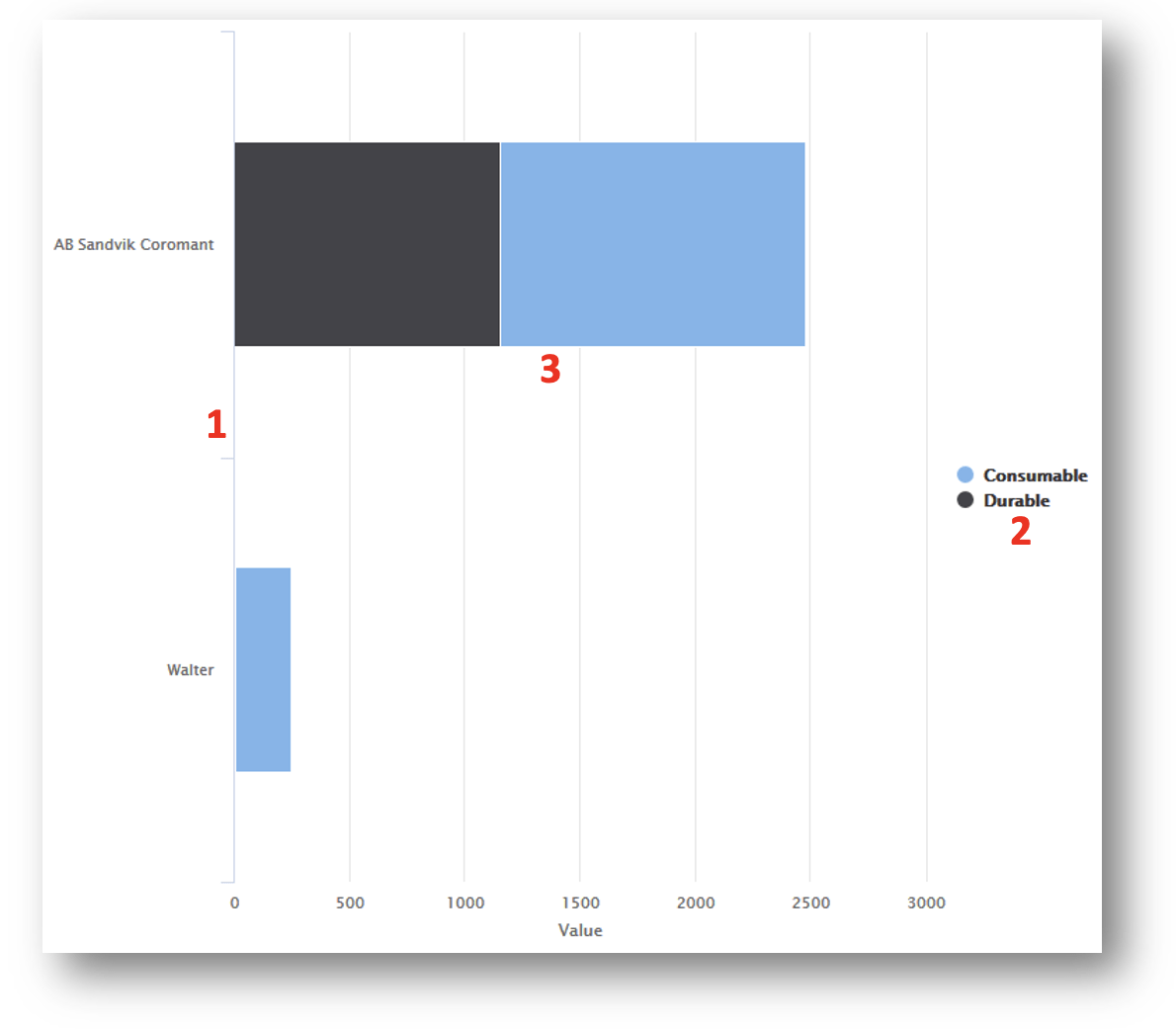
Column chart allows to show reporting data using two axis by total value comparison. In principle, it is column chart stacked with switched axis.
| Categories | Contains field which will be used as Y for the chart. All data fields allowing grouping a data can be used. One data field must be specified to allow report to be saved and executed. Fields from the group can be moved to different section or back to available fields section using drag and drop |
| Series | Contains field which will further separate categories per another dimension. Option is mandatory. If series is not specified, single default series will be used in report. Fields from the group can be moved to different section or back to available fields section using drag and drop |
| Values | Contains field of value type which will be used in the report to show aggregated values (sum of values) per each category selected in Categories section and Series (if set). Only fields marked as values ( ) can be placed to this section.One data field must be specified to allow report to be saved and executed. Fields from the group can be moved to different section or back to available fields section using drag and drop |
Example In following example, report definition is defined as follows:
Categories set to vendor name
(1). Series set to item type
(2). Value set to consumed quantity
(3).
Line chart
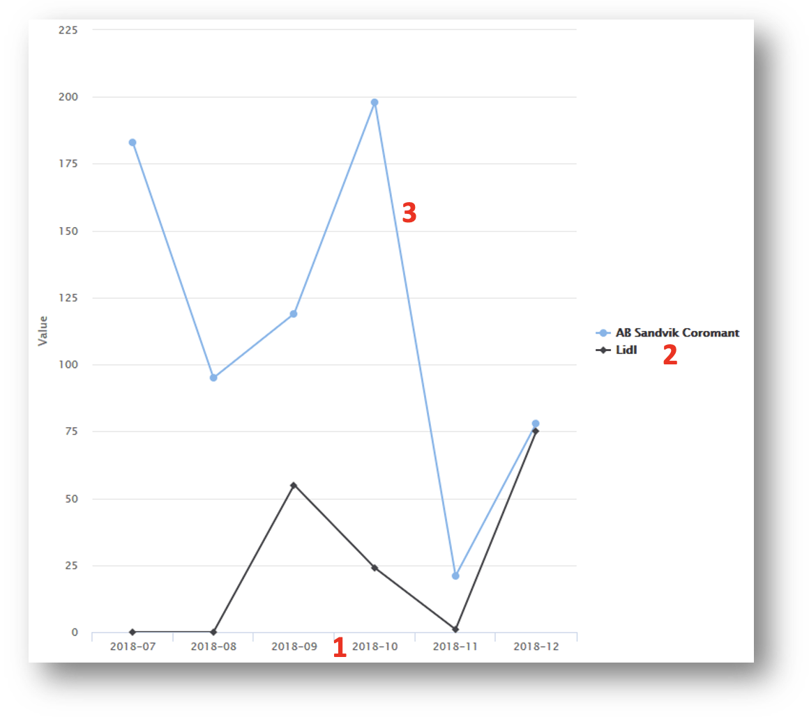
Line chart allows to show reporting data using two axis by total value comparison. It is suitable for showing development of monitored value in time.
| Categories | Contains field which will be used as X for the chart. All data fields allowing grouping a data can be used. For line charts, typical category can be point in time. One data field must be specified to allow report to be saved and executed. Fields from the group can be moved to different section or back to available fields section using drag and drop |
| Series | Contains field which will further separate categories per another dimension. For line chart, separate line is displayed of each series. Option is mandatory. If series is not specified, single default series will be used in report. Fields from the group can be moved to different section or back to available fields section using drag and drop |
| Values | Contains field of value type which will be used in the report to show aggregated values (sum of values) per each category selected in Categories section and Series (if set). Only fields marked as values ( ) can be placed to this section.One data field must be specified to allow report to be saved and executed. Fields from the group can be moved to different section or back to available fields section using drag and drop |
Example In following example, report definition is defined as follows:
Categories set to year-month
(1). Series set to vendor name
(2). Value set to consumed quantity
(3).
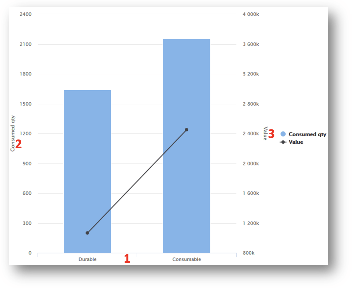
Combined chart
Chart allows to show two value axis in single chart (using column and line visualization) allowing to compare two values for single category.
| Categories | Contains field which will be used as X for the chart. All data fields allowing grouping a data can be used. One data field must be specified to allow report to be saved and executed. Fields from the group can be moved to different section or back to available fields section using drag and drop |
| Value | Contains field of value type which will be used in the report to show aggregated values (sum of values) per each category selected in Categories section and Series (if set). Value will be shown on left Y axis. Only fields marked as values ( ) can be placed to this section.One data field must be specified to allow report to be saved and executed. |
| Value 2 | Contains field of value type which will be used in the report to show aggregated values (sum of values) per each category selected in Categories section and Series (if set). Value will be shown on right Y axis.Only fields marked as values ( ) can be placed to this section.One data field must be specified to allow report to be saved and executed. Fields from the group can be moved to different section or back to available fields section using drag and drop |
Example In following example, report definition is defined as follows:
Categories set to item type
(1). Value set to consumed quantity
(2). Value 2 set to consumed value
(3). 
Troubleshooting
| Problem | Likely cause | Fix |
| The report cannot be saved. | The name is not unique, or a mandatory section is empty – most chart types need one category and one value. | Rename the report and fill the required sections. |
| A field cannot be dropped into Values. | Only fields marked as value type can be aggregated. | Use a field marked with the value-type icon. |
| The data source or report type is greyed out. | Neither can be changed once the report is saved. | Create a new report, or copy this one and change the copy. |
| Values are not summed in a collapsed group. | The group contains values in different currencies. | Filter to one currency, or group by currency as well. |
Related articles
- Report data sources reference – every field you can put in a report.
- How to use report filters – narrow the data behind the report.
- Understanding tabular and chart reports – the viewer, exports and scheduled sending.
- Default reports reference: 19 built-in reports – the predefined reports you can copy.
- How to configure dashboard widgets – pin a finished report to the dashboard.