Admin Portal application is web-based application. When authentication process is successfully completed, main screen of the application is presented.
Application layout
Workspace of the application is divided into three main sections: application header, main menu and main data area.
Application header provides information about logged in user, option to log out from the application navigation breadcrumb and notification bar. Navigation breadcrumb shows all currently opened blades. By clicking on specific blade in the breadcrumb, user is navigated to this blade. Notification bar contains all notifications from the application. It can be opened by clicking on the Bell icon. All options of the application can be accessed from  main menu.
Specific options in the menu consist of submenus. In that case option to return to the previous level is shown. Menu can be collapsed to provide more space for main data area.
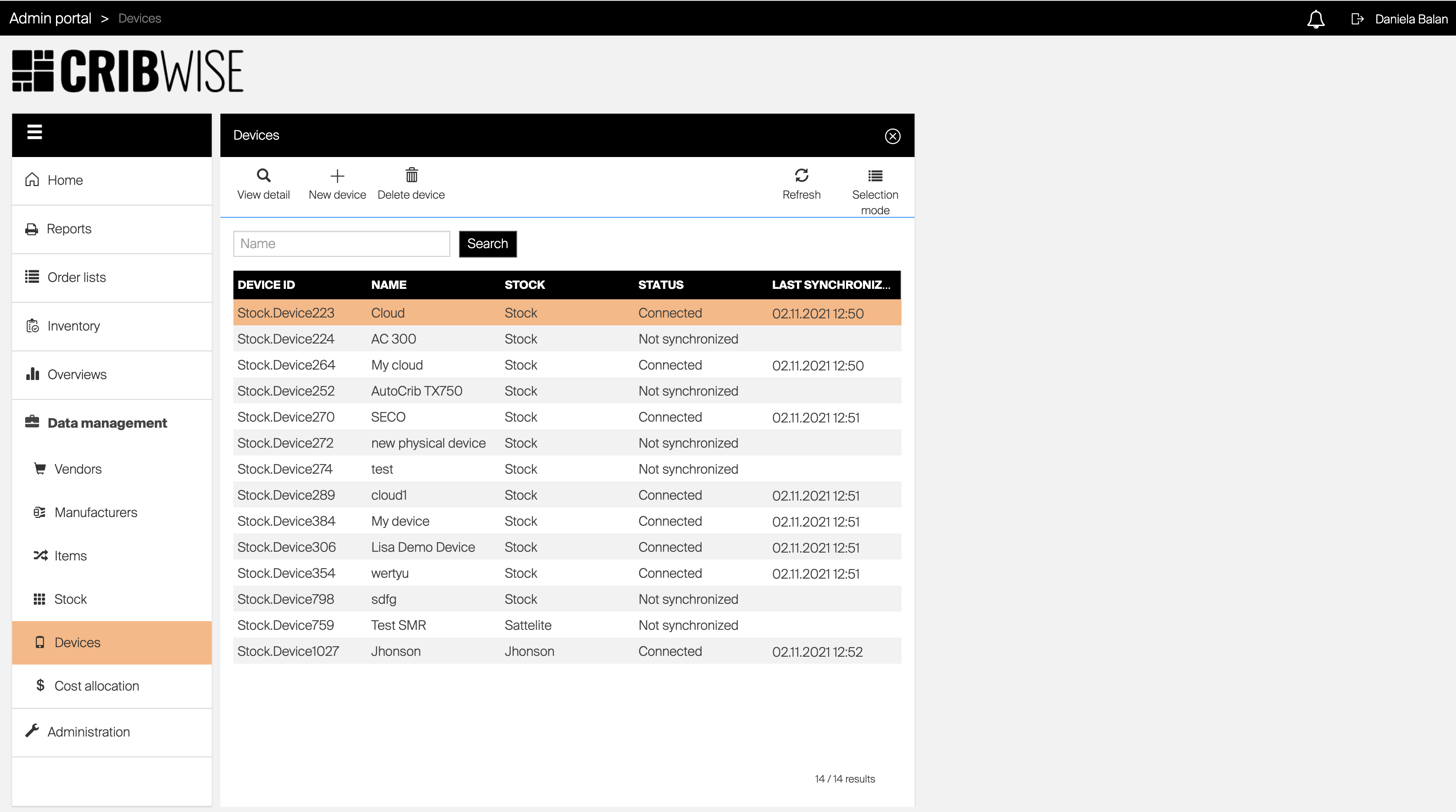
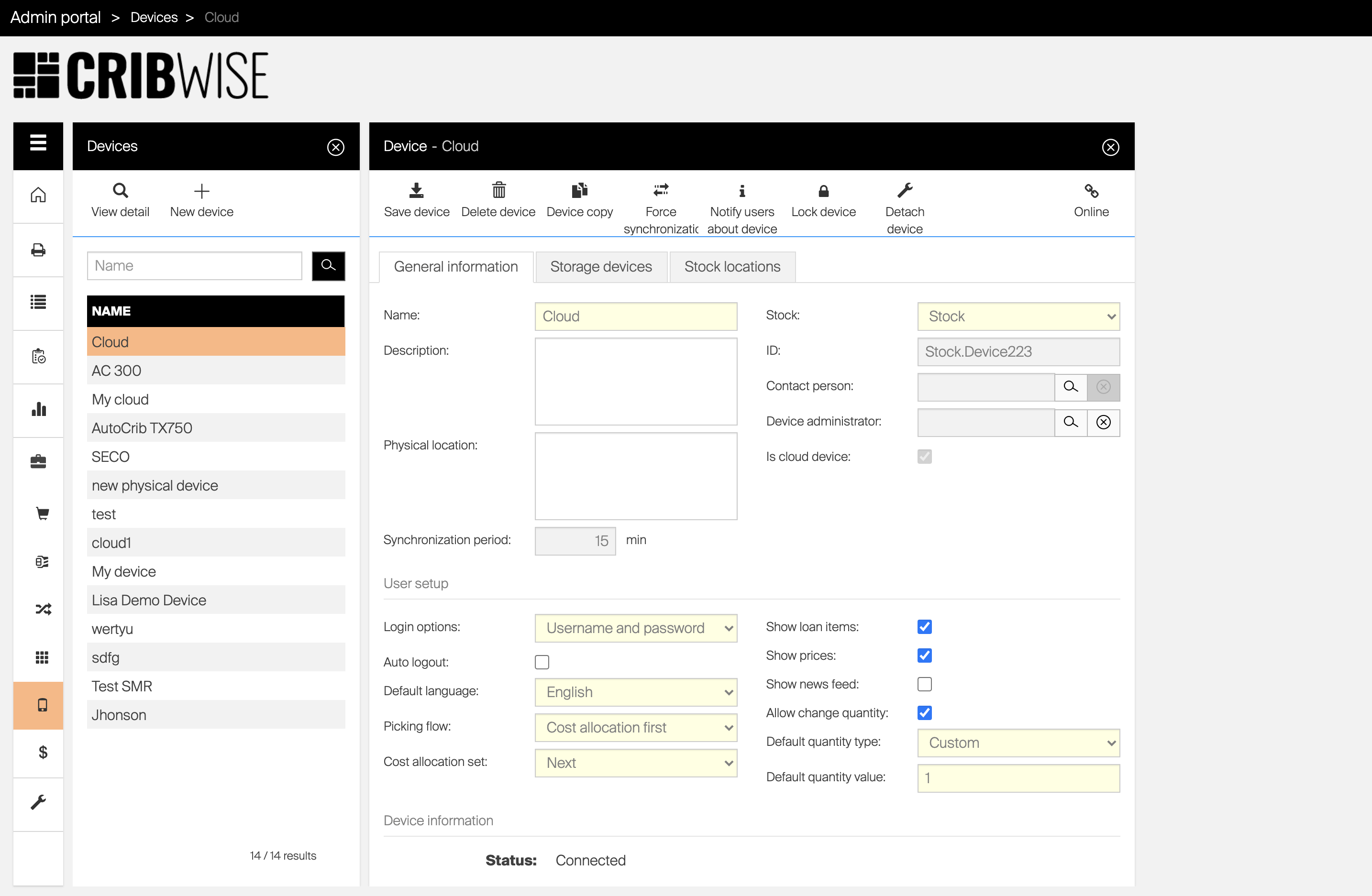
Main data area shows all information relevant to option selected from the main menu. Information are shown inside one or more views. Action in one view can invoke opening of another view. New view is always opened on the right side next to the view from which the action is performed. If there are other views opened at this time, they are closed. When option from the main menu is selected, all opened views are closed.
The image above shows the situation when ‘Devices’ option has been selected from the main menu.
This opened a new view containing a list of devices and the device has been selected.
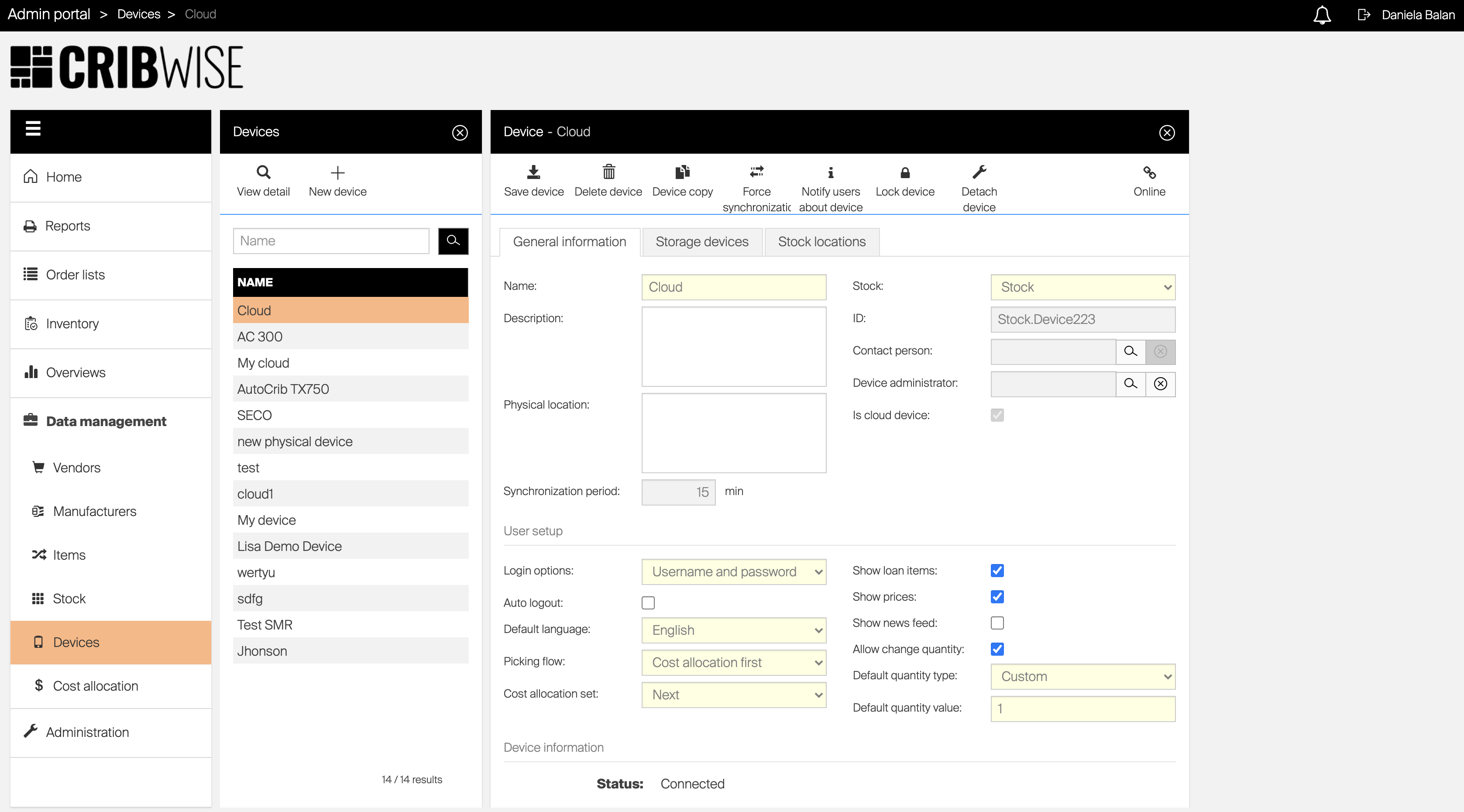
Based on this action a new view has been opened containing detail of selected device.
Selection of another device in the list will result in closing currently opened detail and opening of detail of selected device.
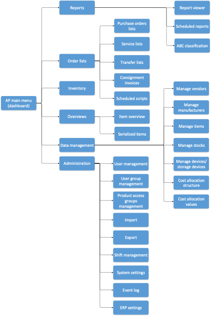
Menu structure
The image bellow shows the structure of Admin Portal menu and its submenus and illustrates how each option can be accessed.
Objects management
The core functionality of Admin Portal (AP) application is to define and manage stock structure with assigned items, define permissions and rules for users and report events within the stock.
For these purposes various objects are used to represent one specific part of the solution. As example of object Item, Device or User can be mentioned. For objects management usually two main windows are used. These windows are called blades.
The first blade contains a list of all objects of selected type, the second one is dedicated to show object detail. Based on selected object some additional blade can be shown to define additional information, for example relations to other objects. Each blade consists of three parts:
- header (showing information about the opened blade)
- blade options (allowing to perform actions specific for selected object)
- and blade content (as the main blade data area).
Work with object list
For list of objects, for example list of items, user can customize information shown in the list. This customization is always remembered for each user and is available on all main lists of objects.
Following customization is saved automatically when done and will be shown again automatically when user will open the list the next time:
- Width of columns
- Columns shown
- Columns order
- Advanced filter
- Sorting
It is possible to save all mentioned settings into a view and switch between saved views to load specific list appearance.
Select and order columns
To select columns shown in a list and their order, press Columns ( ) option in list controls (if this option is not available, columns cannot be selected for this list).
All available columns will be listed.
To activate column for a list, mark desired column with a checkbox.
Uncheck the checkbox for a column to hide it.
Some columns are mandatory in a list and must be always shown, in such case the checkbox cannot be unmarked.
To change order of columns, drag column by  icon and drop it on desired place.
Confirm changes by Save button to reload the list with new settings.
Order rows
To order rows shown in a list, click on row header to set sorting by desired column. Indication of the sorting will be shown next to the header label.
Subsequent clicking on the header will alter between sorting ascending, sorting descending and no sorting.
It is possible to apply more levels of sorting.
Apply sorting on header which should be used as a first level sorting. Then hold SHIFT and click on a column header which should be used for second level sorting.
Indication of levels will appear next to sorting icons.
Filter data
Lists usually allow to filter data via search strings.
Such filtering is not saved for a list and will be cleared once the list is reopened again.
Some lists, like list of items and item overviews, allows extended filtering based on combination of parameters for shown objects.
Such filtering is called Advanced filtering and can be invoked by pressing Advanced filter ( ) option in list controls (if this option is not available, advanced filters are not available for current list).
Opened blade will list all parameters which can be used for the filtering.
Once filters are set and confirmed, list is reloaded to show data only according active filters.
Active filters will be shown above the list.
There is AND condition between all active filters.
To clear active advanced filters, press Clear filter shown bellow list of all active filters, or press Advanced filter () option in list controls and select Clear filter.
Create and load a view
To create a new view, customize object list and press Saved views ( ) option in list controls (if this option is not available, view cannot be saved for this list).
Select option to Save as a new view and name the new view.
To load existing view, press Saved views () option in list controls.
Select the saved view and press Open to load it. L
ist appearance will be set according the loaded view.
To load default state of the list, press Saved views () option in list controls.
Then select Restore defaults to load default appearance of the list.
Select multiple objects
Some lists allows to select multiple objects to perform mass update or delete them.
When this option is available, Selection mode ( ) can be pressed to toggle between mode to select multiple rows and single row only.
Once activated, multiple rows can be selected by clicking on a row.
Selecting a row while holding a SHIFT will select all rows between the current one and the one selected before.
Specific blade options can be enabled only while the selection mode is active (and vice versa).
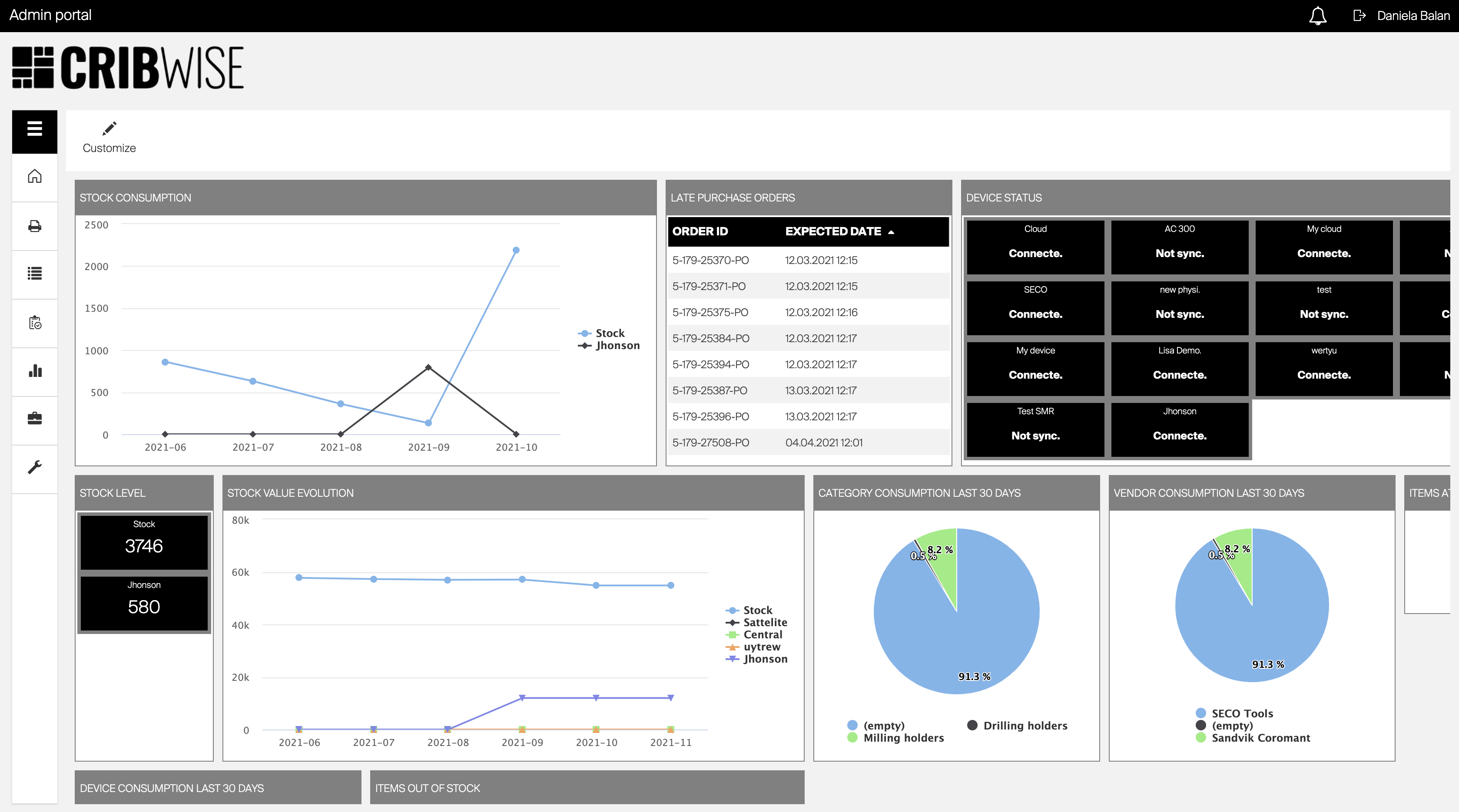
Dashboard
Dashboard acts as a home screen of the application.
It is shown when the user is logged in, if all the views are closed or ‘Home’ is selected from the main menu.
Content of the dashboard consists of separate widgets showing various types of information.
The order and visible widgets are customizable per each user.
Information shown by each widget is described in the Widgets article, together with steps to add, remove and rearrange widgets on dashboard.