Read time: ~5 minutes
Applies to: Admin Portal
What you’ll learn
Find your way around the Admin Portal – the header, main menu, and data area and learn how to customize, sort, filter, and save the object lists you work with every day.
Admin Portal layout at a glance
The Admin Portal is a web-based application. After you sign in, the main screen opens with three areas that stay consistent everywhere you go.
| Area | Where it is | What it does |
|---|---|---|
| Application header | Top of the screen | Shows the logged-in user, the log-out option, the navigation breadcrumb, and the notification bell. |
| Main menu | Left side | Opens every part of the application. Submenus expand in place, and the menu can collapse to free up space. |
| Main data area | Center / right | Shows the information for whatever you selected in the menu, inside one or more views. |
The application header explained
The header keeps your account controls and context in one place.
- User and log out – shows who is signed in and lets you sign out.
- Navigation breadcrumb – lists every blade you currently have open. Click any blade in the breadcrumb to jump straight to it.
- Notification bar – collects all application notifications. Open it with the Bell icon.
Open every part of the application from the main menu  on the left. Options that contain submenus show a control to step back to the previous level, and you can collapse the menu to give the data area more room.
The main data area explained
The main data area shows everything related to the option you picked from the menu, inside one or more views. An action in one view can open another view to its right. Opening a new view closes any other views already open, and selecting a different menu option closes all open views.
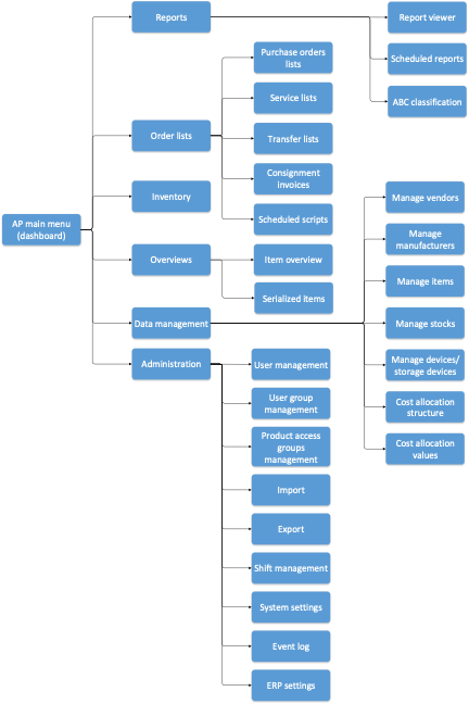
Menu structure
The diagram below shows the full Admin Portal menu with its submenus and how to reach each option.
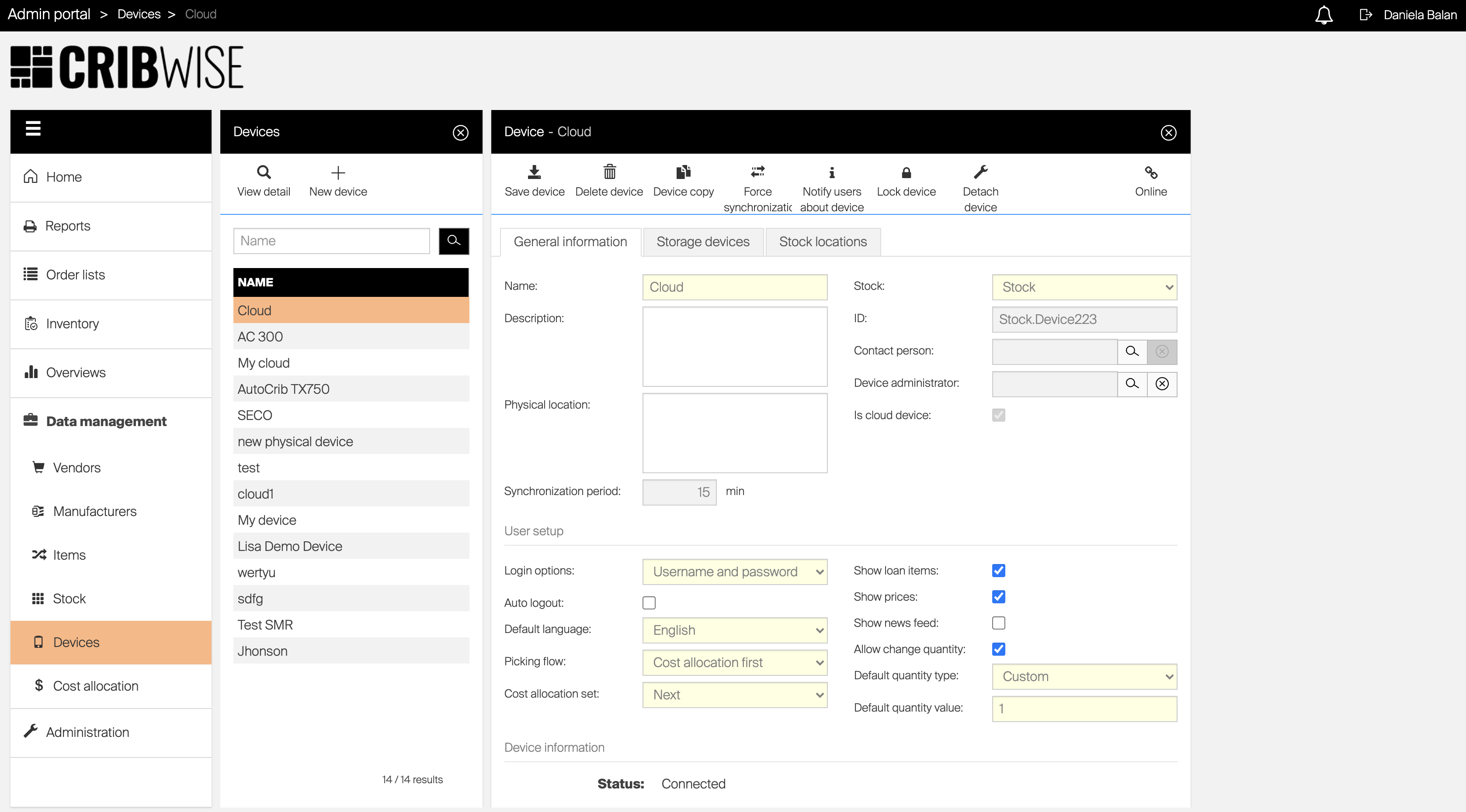
Objects and blades explained
The core job of the Admin Portal is to define and manage your stock structure with assigned items, set permissions and rules for users, and report events within the stock. Each part of the solution is represented by an object – for example an Item, a Device, or a User.
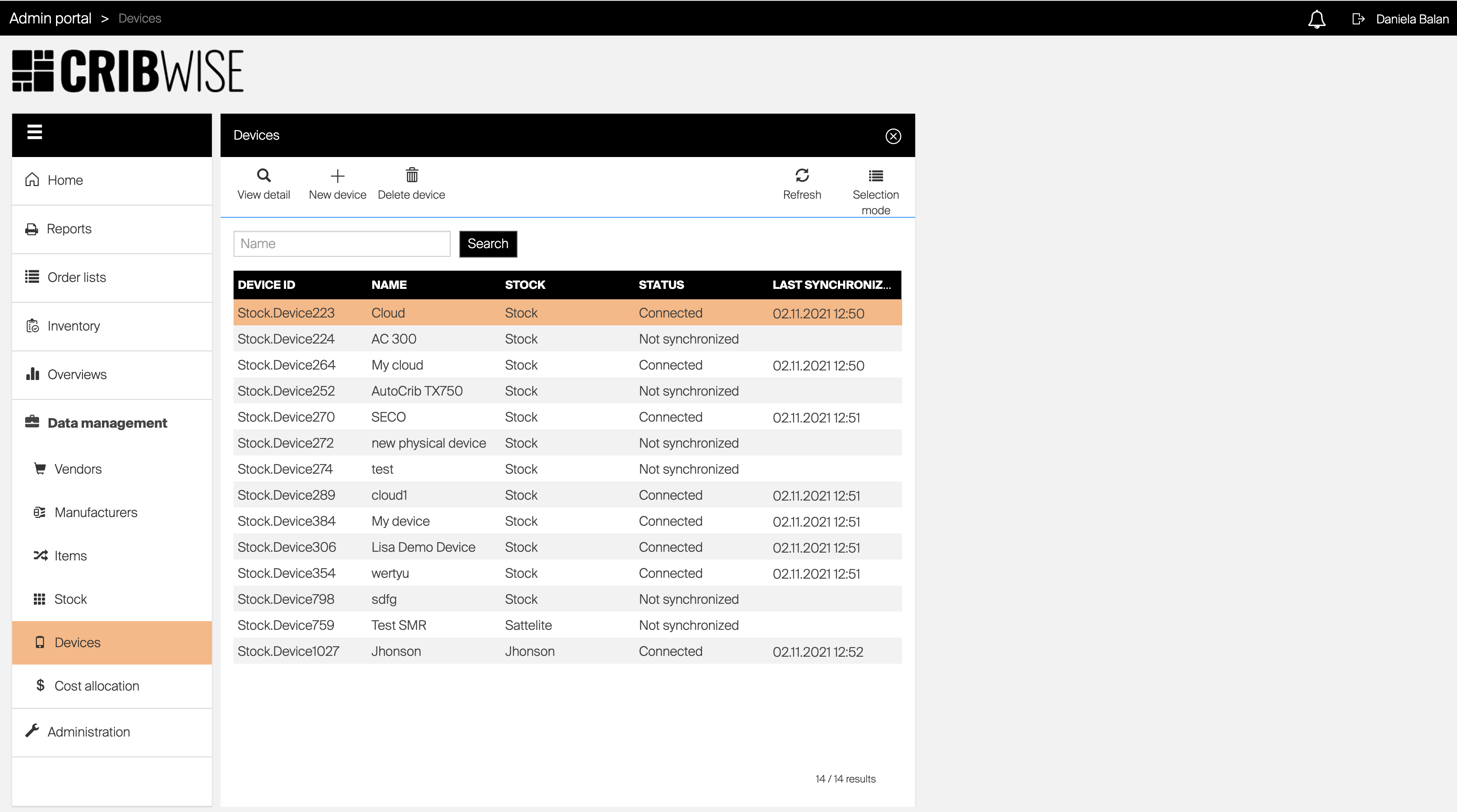
Objects are managed in windows called blades. Typically two blades work together: the first lists all objects of a type, and the second shows the detail of the object you select. Depending on the object, an extra blade can appear for additional information, such as relations to other objects. Every blade has three parts:
- Header – information about the open blade.
- Blade options – actions specific to the selected object.
- Blade content – the main data area of the blade.
Working with object lists
On a list of objects — for example the item list — you can customize what the list shows. Your customization is remembered per user and applies to every main object list. The following settings are saved automatically and reappear the next time you open the list:
- Column widths
- Which columns are shown
- Column order
- Advanced filter
- Sorting
You can also save all of these settings into a view and switch between saved views to load a specific list appearance.
Select and order columns
Press Columns  in the list controls. (If the option is not available, columns cannot be selected for this list.) Then:
- Check a column to show it; uncheck it to hide it.
- Mandatory columns are always shown – their checkbox cannot be cleared.
- To reorder columns, drag a column by the
 handle and drop it where you want it.
Press Save to reload the list with your new settings.
Sort rows
Click a column header to sort the list by that column; an indicator appears next to the header label. Clicking the header again cycles through ascending, descending, and no sorting.
To sort by more than one column, apply sorting on the first column, then hold SHIFT and click a second column header. The sorting level appears next to each sort indicator.
Filter data
Most lists let you filter by a search string. This filter is not saved and clears when you reopen the list.
Some lists — such as the item list and item overviews- support Advanced filtering based on a combination of parameters. Press Advanced filter  in the list controls to open a blade listing every available parameter. Set your filters and confirm; the list reloads to show only matching data, and active filters appear above the list.
Important: There is an AND condition between all active filters – a row must match every filter to appear.
To clear advanced filters, press Clear filter below the list of active filters, or open Advanced filter and select Clear filter.
Save and load a view
To save your current layout, customize the list and press Saved views  in the list controls, then select Save as a new view and name it. (If the option is not available, views cannot be saved for this list.)
To load a saved view, press Saved views , select the view, and press Open. To return to the default layout, press Saved views and select Restore defaults.
Select multiple objects
Some lists let you select several objects at once to update or delete them in bulk. When this is available, press Selection mode  to toggle between selecting multiple rows and a single row.
- With selection mode on, click rows to select them.
- Hold SHIFT and click to select every row between your last selection and the new one.
- Some blade options are enabled only while selection mode is active – and vice versa.
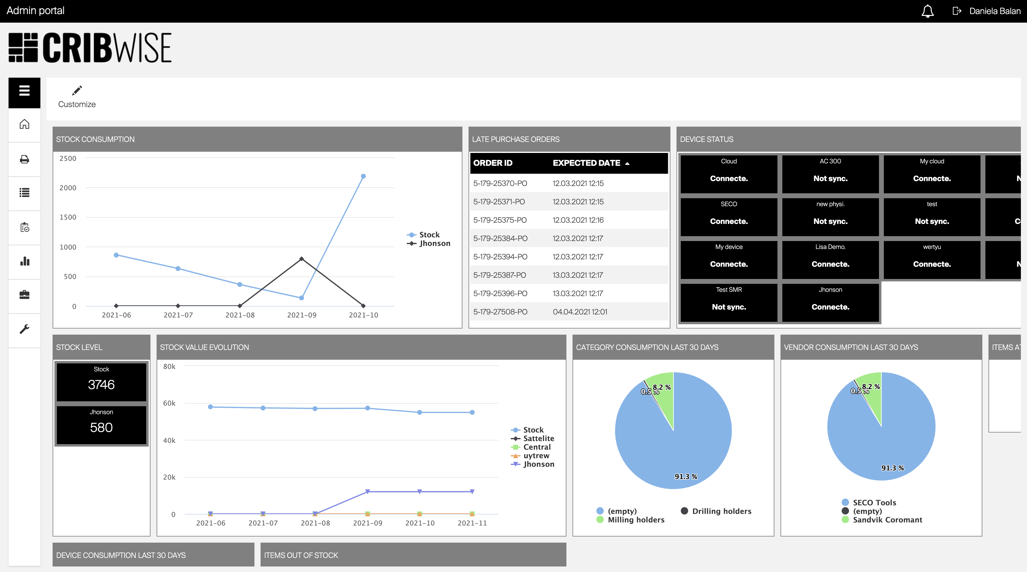
The dashboard
The dashboard is the home screen of the application. It appears when you log in, when all views are closed, or when you select Home from the main menu. It is built from separate widgets, each showing a different type of information, and both the order and the visible widgets are customizable per user.
Common confusion
| People often think | But actually |
|---|---|
| Opening a new view keeps the old ones open side by side. | A new view opens to the right and closes any other open views. Selecting a menu option closes them all. |
| List customizations need to be re-applied every session. | Column width, order, visibility, sorting, and advanced filters are saved automatically per user and reload next time. |
| A search-box filter is saved like the other list settings. | Search-string filters are temporary and clear when you reopen the list. Only advanced filters are saved. |
| Multiple advanced filters broaden the results. | Filters combine with AND, so each one narrows the results further. |